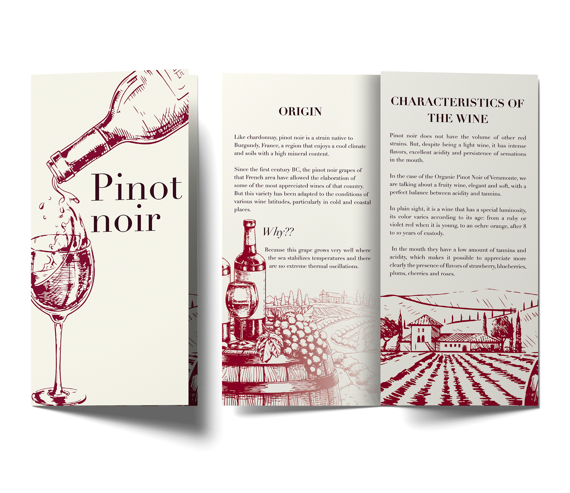
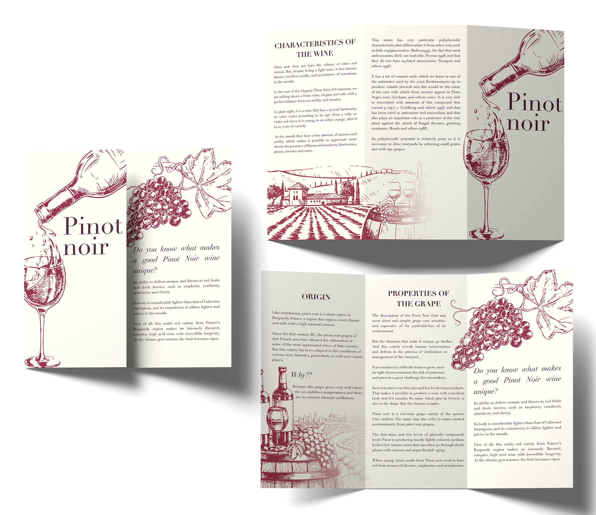
The goal of the brochure project is to educate wine lovers about the origins and production methods of one of the most costly wines in the world. But what makes it stand out is its simple, sophisticated design, which expertly balances two primary hues while emphasizing the wine's natural color. The design is notable for its use of straightforward yet lovely graphics, which lends the project a sense of elegance. The project demonstrates design expertise, effective communication, and aesthetic appreciation in a single, attractive package by merging information with visually appealing design
Typography

Colors

Mockups